Generally speaking, it's not common to use pie charts to demonstrate our data, especially in statistics or research. Whereas it’s very popular in business charts, so here are some tips in drawing pie charts and bar plots.
Pie and donut chart
For instance, how to create a pie chart or a donut chart? If using R software and the ggplot2 package, the function coor_polar() is recommended, as the pie chart is just a stacked bar chart in polar coordinates.
Create a simple dataset:
df <- data.frame(
  group = c("Female", "Male", "Child"),
  value = c(25, 30, 45),
  Perc = c("25%", "30%", "45%")
)
And then create a pie chart:
ggplot(df2, aes(x = "", y = value, fill = group))+
  geom_bar(width = 1, stat = "identity") +
  coord_polar("y", start=0)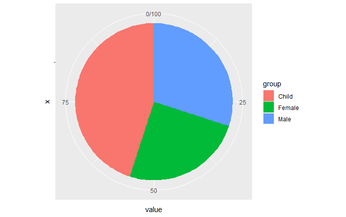
Above is a default style, maybe It seems a bit different to some pie charts from business tools, and not common so we want to remove axis tick and mark labels. To be more advanced, we probably need to add text annotations, therefore we should create a customized pie chart in theme() and geom_text() function. For having pretty colour panels, the ggsci package is highly recommended.
Here there is one point: if you need to add mark labels by
geom_textfunction, please sort your fill (group/factor) variable firstly, otherwise the text label will be located in the wrong position.
Create a custome theme, and calculate the position of each label in the pie chart.
mytheme <- theme_minimal()+
  theme(
    axis.title = element_blank(),
    axis.text.x = element_blank(),
    panel.border = element_blank(),
    panel.grid = element_blank(),
    axis.ticks = element_blank(),
    legend.key.size = unit(15, "pt"),
    legend.text = element_text(size = 12),
    legend.position = "top"
  )

df2 <- df %>%
  mutate(
    cs = rev(cumsum(rev(value))),
    pos = value/2 + lead(cs, 1, default = 0)
  )
The pie chart below seems more fashionable than the front ones.
ggplot(df2, aes(x = "", y = value, fill = fct_inorder(group)))+
  geom_bar(width = 1, stat = "identity") +
  coord_polar("y", start=0) +
  ggsci::scale_fill_npg() +
  mytheme +
  geom_text(aes(y = pos), label = Perc, size = 5) +
  guides(fill = guide_legend(title = NULL))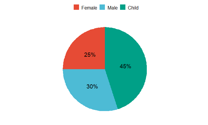
Categorical data are often better understood in a donut chart rather than in a pie chart, although I always think both of them are the same. But unlike the pie chart, to draw a donut chart we must specify the x = 2 in aes() and add xlim() to limit it.
ggplot(df2, aes(x = 2, y = value, fill = fct_inorder(group)))+
  geom_bar(width = 1, stat = "identity") +
  coord_polar("y", start = 200) +
  xlim(.2,2.5) +
  ggsci::scale_fill_npg() +
  theme_void() +
  geom_text(aes(y = pos), label = Perc, size = 5, col = "white") +
  guides(fill = guide_legend(title = NULL))
However, we find that it’s not easy to remember the parameters of pie and donut charts. What is the more simple way to demonstrate it? I think the ggpie() and ggdonutchart() functions in the ggpubr package are preferred.
More details should refer to https://rpkgs.datanovia.com/ggpubr/reference/index.html, it also includes other useful plot functions. Here is the donut chart as an example.
In addition, the geom_label_repel function is better to add text annotation I think.
df2 <- df2 %>%
  mutate(group = fct_inorder(group),
         tmp = "")
ggpubr::ggdonutchart(data = df2, x = "value", label = "tmp",
                     lab.pos = "in", fill = "group", color = "black", palette = "npg") +
  geom_label_repel(aes(y = pos, label = paste0(group, " (", Perc, ")"), fill = group, segment.color = pal_npg("nrc")(3), segment.size = 0.8),
                   data = df2, size = 4, show.legend = F, nudge_y = 1, color = "black") +
  guides(fill = FALSE)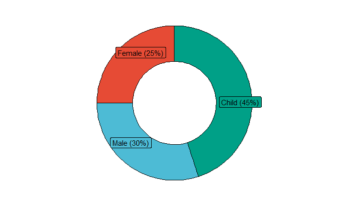
The more pretty design could be referred to by this blog. (Donut chart with ggplot2)
Barplot
This tip is about how to add labels to a dodged barplot when I have to specify the position=position_dodge() and width = simultaneously. If you are careless, you will find out the text annotations are in the incorrect position.
In this situation, we must specify the consistent width value in all position related functions, such as geom_bar(), position_dodge() and geom_text().
df <- data.frame(supp = rep(c("VC", "OJ"), each = 3),
              dose = rep(c("D0.5", "D1", "D2"),2),
              len = c(6.8, 15, 33, 4.2, 10, 29.5))

ggplot(data = df, aes(x = dose, y = len, fill = supp)) +
  geom_bar(stat = "identity", color = "black", position = position_dodge(0.65), width = 0.65)+
  theme_minimal() +
  geom_text(aes(label = len), vjust = -0.5, color = "black",
            position = position_dodge(0.65), size=3.5) +
  scale_fill_brewer(palette = "Blues")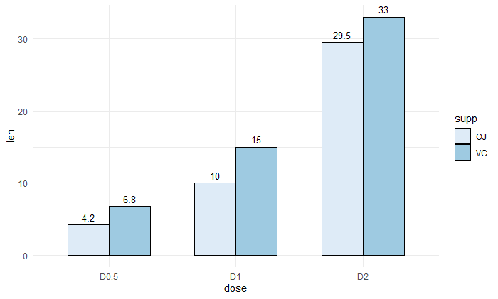
Then how about a stacked barplot? We must calculate the pos variable and specify it in geom_text() as y asix.
df2 <- arrange(df2, dose, supp) %>%
  plyr::ddply("dose",
        transform, label_ypos=cumsum(len))

ggplot(data = df2, aes(x = dose, y = len, fill = supp)) +
  geom_bar(stat = "identity")+
  geom_text(aes(y = label_ypos, label=len), vjust = 1.6,
            color = "black", size = 3.5)+
  scale_fill_brewer(palette = "Blues")+
  theme_minimal()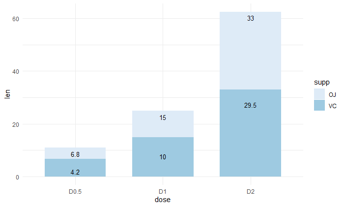
Obviously, if you apply the ggbarplot() function of the ggpubr package, the fewer parameters you need to calculate and remember. (https://rpkgs.datanovia.com/ggpubr/reference/ggbarplot.html)
Reference
ggplot2 pie chart : Quick start guide - R software and data visualization
ggplot2 barplots : Quick start guide - R software and data visualization
https://ggplot2.tidyverse.org/reference/
http://www.sthda.com/english/wiki/ggplot2-essentials
https://rpkgs.datanovia.com/ggpubr/reference/index.html
Plotting Pie and Donut Chart with ggpubr pckage in R
Please indicate the source: http://www.bioinfo-scrounger.com