I have kept a note about logistic regression for biomarkers using R, and mentioned that I’d like to compare the code of R and SAS. Therefore how to use SAS to estimate a logistic regression model?
To be perfectly honest, I’m not pretty sure that what I do is correct as I’m a new recruit in SAS. However I have strong experience in R so I’m accustomed to think of problems and solve them in R.
Due to the work, I need to learn to manipulate data by R and SAS simultaneously. In this post I expect to use SAS to complete the same procedure with that blog(Logistic Regression for biomarkers). The steps that will be covered are the following:
- Check variables distributions and correlation
- Fit logistic regression model
- Predict the probability of the event
- Compare two ROC curve
Firstly I load the same dataset from R package mlbench by the IML/SAS procedure. The submit and endsumbit can wrap R code in SAS and run it.
proc iml;
  submit /R;
  data("PimaIndiansDiabetes2", package = "mlbench")
  endsubmit;
  call ImportDataSetFromR("work.diabetes2", "PimaIndiansDiabetes2");
run;
quit;
We can take a look at the frequency of categorical variables in summary table as following:
proc freq data=diabetes2;
  tables diabetes;
run;
We can also check the continuous variables as following:
proc means data=diabetes2;
  var age glucose insulin mass pedigree pregnant pressure triceps;
run;Moreover I choose graphs to demonstrate the distribution and correlation of the variables. I always think that graphs are often more informative. For instance, histogram plot is easy to examine the distribution and look for outliers.
proc template;
    define statgraph multiple_charts;
        begingraph;
            entrytitle "Two distributions";

            /* Define Chart Grid */
            layout lattice / rows = 1 columns = 2;

                /* Chart 1 */
                layout overlay;
                    entry "Glucose Histogram" / location=outside;
                    histogram glucose / binwidth=10;
                endlayout;

                /* Chart 2 */
                layout overlay;
                    entry "Pressure Histogram" / location=outside;
                    histogram pressure / binwidth=5;
                endlayout;
            endlayout;
        endgraph;
    end;
run;

proc sgrender data=diabetes2 template=multiple_charts;
run;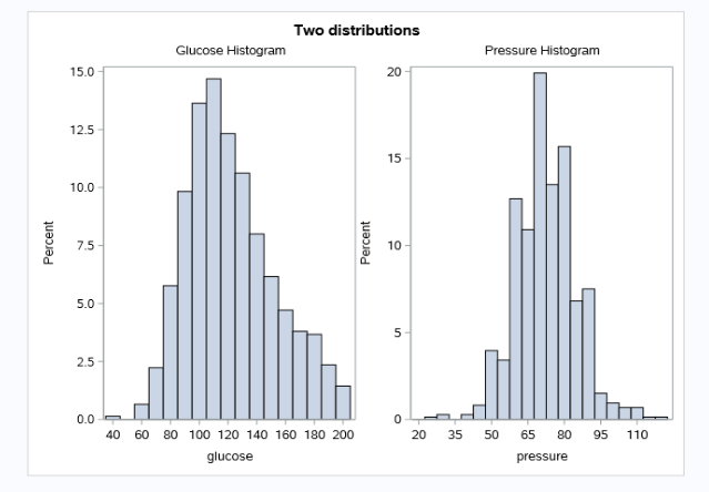
For the aspect of variable correlation, heatmap scatter plot is a better way often.
* calculate correlation matrix for the data;
ods output PearsonCorr=Corr_P;
proc corr data=diabetes2;
    var age glucose insulin mass pedigree pregnant pressure triceps;
run;

proc sort data=Corr_P;
    by Variable;
run;

* transform wide to long;
proc transpose data=Corr_P out=CorrLong(rename=(COL1=Corr))
        name=VarID;
    var age glucose insulin mass pedigree pregnant pressure triceps;
    by Variable;
run;

proc sgplot data=CorrLong noautolegend;
  heatmap x=Variable y=VarID / colorresponse=Corr colormodel=ThreeColorRamp; *Colorresponse allows discrete squares for each correlation.;
  text x=Variable y=VarID text=Corr / textattrs=(size=10pt); /*Create a variable that contans that info and set text=VARIABLE */
  label Corr='Pearson Correlation';
  yaxis reverse display=(nolabel);
  xaxis display=(nolabel);
  gradlegend;
run;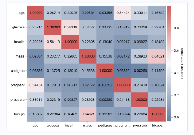
These two figures show that glucose and pressure are normal distribution basically, and they have no relatively high correlation.
Before fitting the model, we firstly reformat the diabetes variable and keep the glucose and pressure variables without any NA.
proc format;
  value $diabetes
     "pos"=1
     "neg"=0;
run;

data inputData;
  set diabetes2(keep=diabetes glucose pressure);
  if nmiss(of _numeric_) + cmiss(of _character_) > 0 then delete; /*remove NA rows*/
  format diabetes $diabetes.;
run;
To fit the logistic regression model in SAS, generally we will use the following code:
ods graphics on;
proc logistic data=inputData plots(only)=roc;
  model diabetes(event="1") = glucose pressure;
  output out=estimates p=est_response;
  ods output roccurve=ROCdata;
run;
The plots(only)=roc means we only expect to display a roc plot, and we can get all probabilities of prediction from the est_response column in estimates dataset. With the ods output, we save the roc curve relative data into ROCdata directly.
Indeed it seems very considerate, but I think it’s just not flexible. Because it will result in not useful programming.
In this case, I don’t specify class variables. Otherwise If you specify class variables when the param option is set equal to either ref or glm, SAS will automatically create dummy variables. (Without specifying param, the default coding for two-level factor variables is -1, 1, rather than 0, 1 like we prefer).
The model partial results are the following:
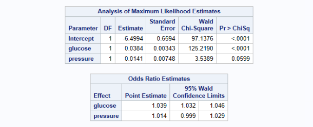
We can find that the variable estimates are equal to those from R. In addition we can automatically get the odds ratio estimates for each variable as well. Actually I can calculate the odds ratio through exp(coef) by myself.
If you would like to know the probability of new data, maybe lsmeans is useful, which has the same effect as predict() in R.
Here it’s the turn to compare two ROC curves, so firstly I have to fit two logistic regression models, one is only glucose, another is glucose plus pressure.
proc logistic data=inputData plots(only)=roc;
  model diabetes(event="1") = glucose;
  output out=estimates p=est_response;
  ods output roccurve=rocdata1;
run;

proc logistic data=inputData plots(only)=roc;
  model diabetes(event="1") = glucose pressure;
  output out=estimates p=est_response;
  ods output roccurve=rocdata2;
run;

data plotdata;
  set rocdata1(in=a) rocdata2(in=b);
  if a then group="mod1";
  if b then group="mod2";
  keep _1mspec_ _sensit_ group
run;
Using set to combine these two roc data for plots. And then use the proc sgplot and series statement to plot the ROC curve.
In proc sgplot, the aspect=1 option requests a square plot which is customary for an ROC plot in which both axes use the [0,1] range. The inset statement writes the individual group AUC (area under the ROC curve) values inside the plot area.
proc sgplot data=plotdata aspect=1;
/*  styleattrs wallcolor=grayEE;*/
  series x=_1mspec_ y=_sensit_ / group=group;
  lineparm x=0 y=0 slope=1 / transparency=.3 lineattrs=(color=gray);
  title "ROC curves for both groups";
  xaxis label="False Positive Fraction" values=(0 to 1 by 0.25)
      grid offsetmin=.05 offsetmax=.05;
  yaxis label="True Positive Fraction" values=(0 to 1 by 0.25)
      grid offsetmin=.05 offsetmax=.05;
  inset ("glucose AUC" = "0.7877" "glucose+pressure AUC" = "0.7913") /
      border position=bottomright;
  title "ROC curves for logistic regression";
run;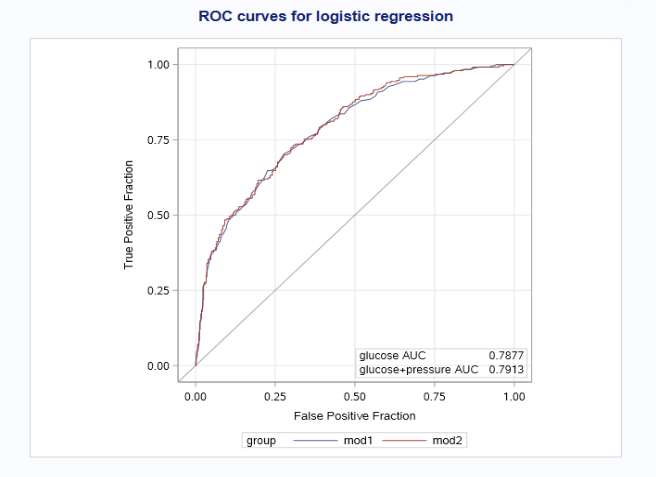
Above is my first note about how to use SAS for analysis and visualization. In the next period of time, I plan to compare some ways of code between R and SAS to push my SAS learning. Hope having a bit of progress in it.
Thanks for the post( Using SAS to Estimate a Logistic Regression Model ) to make me more clear about the logistic regression in SAS.
Reference
Modify the ROC plot produced by PROC LOGISTIC Plot and compare ROC curves from a fitted model used to score validation or other data
Example 78.7 ROC Curve, Customized Odds Ratios, Goodness-of-Fit Statistics, R-Square, and Confidence Limits
Using SAS to Estimate a Logistic Regression Model
sas_correlation_heat_map.sas
SAS系列20——PROC LOGISTIC 逻辑回归
Please indicate the source: http://www.bioinfo-scrounger.com